UI Design Component Size Calculator
As a UI Designer or Front-end Developer, do you often wonder what the ideal size of your component should be (button size, font size, table size) so that it is perfectly seen and read by your user?
Well, here's a simple tool, specially designed for you, that's going to change your everyday life!
Si vous souhaitez utiliser ce calculateur en Français, cliquer ICI.
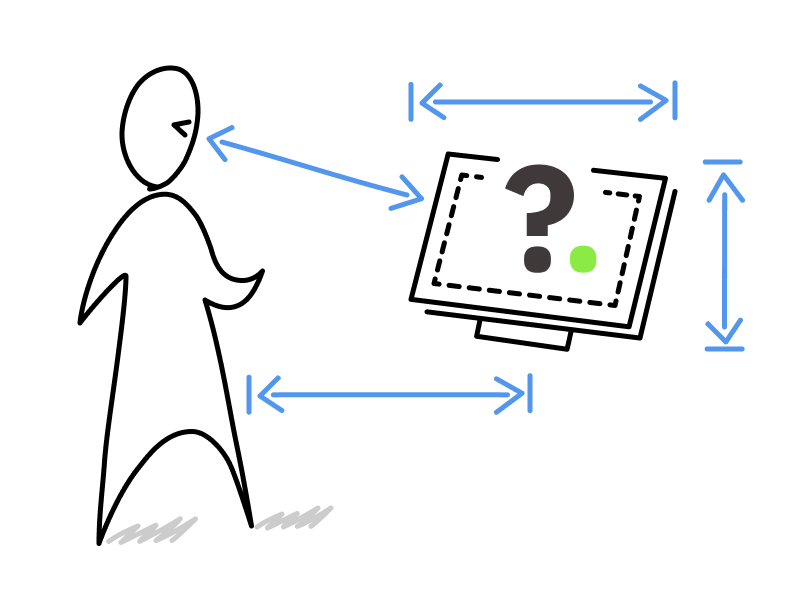
Settings
Recommended Sizes
For inputs and buttons:
recommended height pixels
For text:
H1 Title is pixels
H2 Title is pixels
H3 Title is pixels
H4 Title is pixels
This is a paragraph of text spanning multiple lines. Recommended font-size, based on your inputs is pixels and line height between 1.4 et 1.7 times the font size. Lorem ipsum dolor sit amet consectetur adipisicing elit. Sapiente fuga adipisci, quas ratione nobis esse saepe commodi natus illum dolores doloremque iusto doloribus unde aliquam repellendus corporis sint maiores fugit!
Table header and rows:
Header / row height should be around pixels.
| Full Name | Age | Country | Band |
|---|---|---|---|
| Steve Ignorant | 33 | UK | Crass |
| Captain Sensible | 37 | UK | The Damned |
| Ian Curtis | 29 | UK | Joy Division |
| Martin Gore | 32 | UK | Depeche Mode |
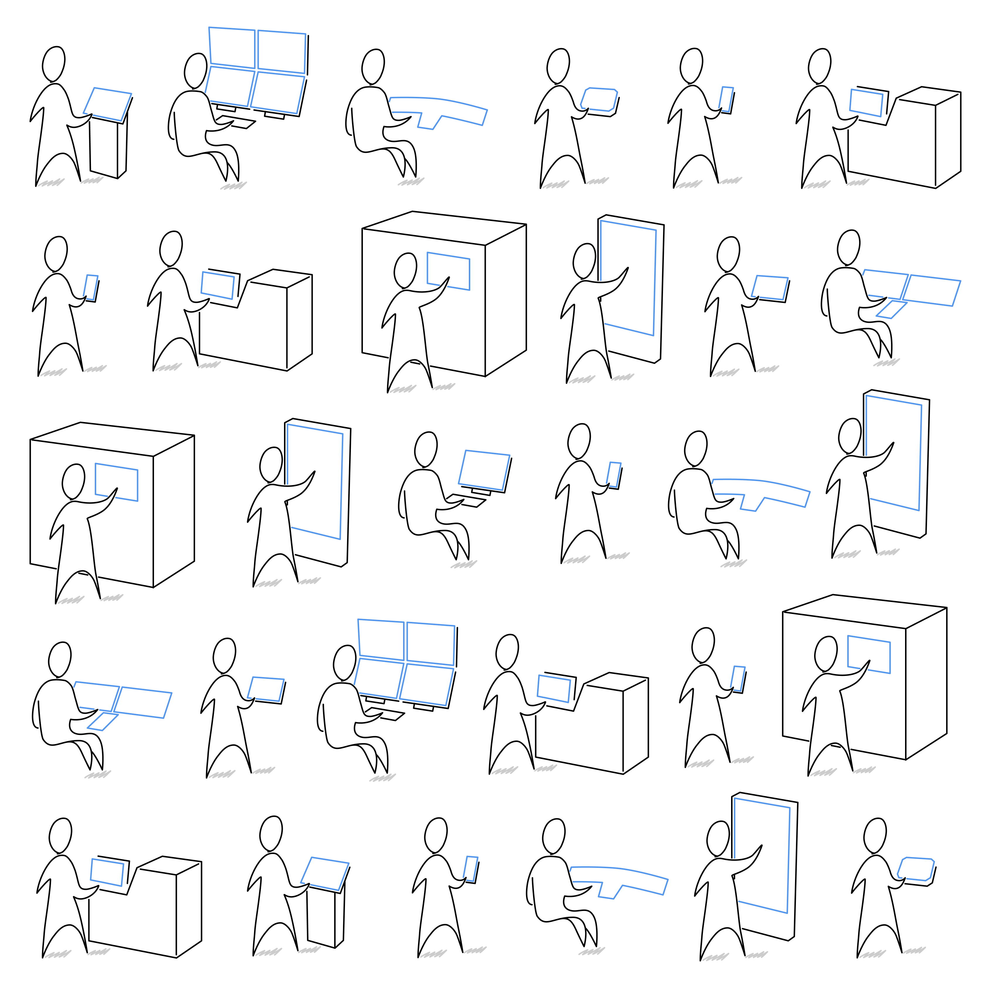
How did we calculate the ideal size for your interface components?
The main criteria for defining the size of your interface components is the distance between your user's eye and the device screen.
We have identified 3 significant contexts :
. mobile use (smartphone, tablet, rugged device, etc.),
. standing (console, desk, machine, terminal, etc.),
. and seating (desk, workstation, cockpit, dashboard, etc.).
And even though the distances may appear similar, we felt it was necessary to adapt some dimensions, such as for standing room (+30% for tactile comfort and average accessibility for the public) or the tactile.
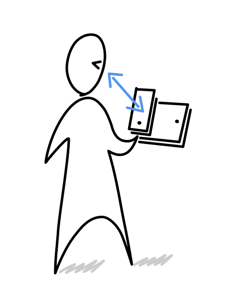
MOBILITY
with a smartphone or tablet (on average 36 cm from the screen)
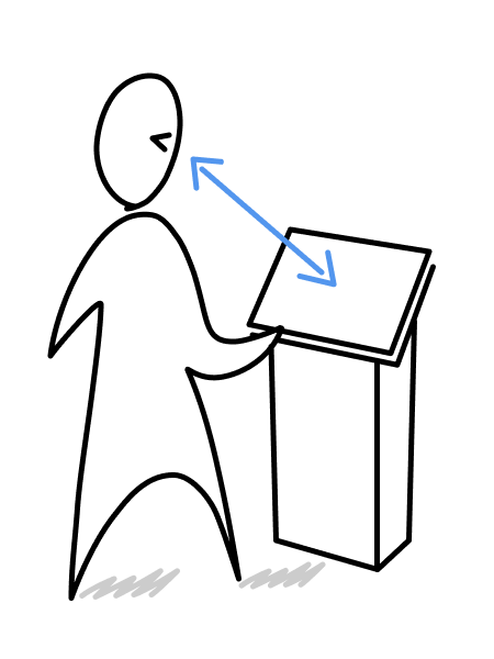
STANDING
in front of a console or desk (on average 71 cm from the screen)
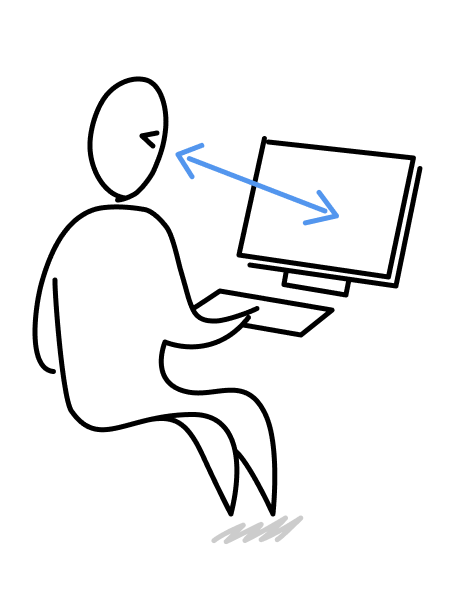
SEATING
in front of a desktop or laptop computer (on average 71 cm from the screen)
Other criteria and components: :

The screen size of your device is the measurement in inches of the diagonal of the display area. - to choose from the list.
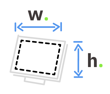
The resolution of your device's panel is the measurement in px (pixels) of the width and heigth of the display area. - to choose from the list.
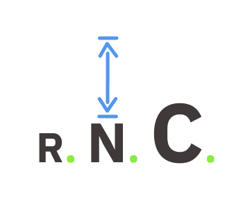
The dimensions given are in 3 scales: Reduced (if you have less space) / Normal (recommended) / Comfort (for better accessibility).
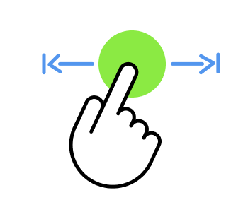
For your TACTILE interfaces, we recommend using the Comfort scale (which offers a 20% gain over the Normal scale).
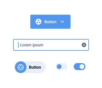
The button component, in all its diversity of forms and applications, must have a minimum size to be visible and operable. In tactile mode, its size is enhanced.
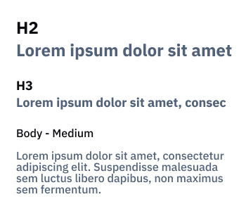
Typefaces / Fonts must offer the designer a wide variety of sizes (often specified as H1, H2...), but they must remain readable in all conditions of use.
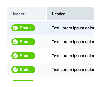
The table rows component is widely used in SaaS and business applications. Users need to be able to discriminate and understand content in order to carry out their activity.
If you would like us to add additional components to your interface dimensioning, please do not hesitate to contact us on: team@use.design
References :
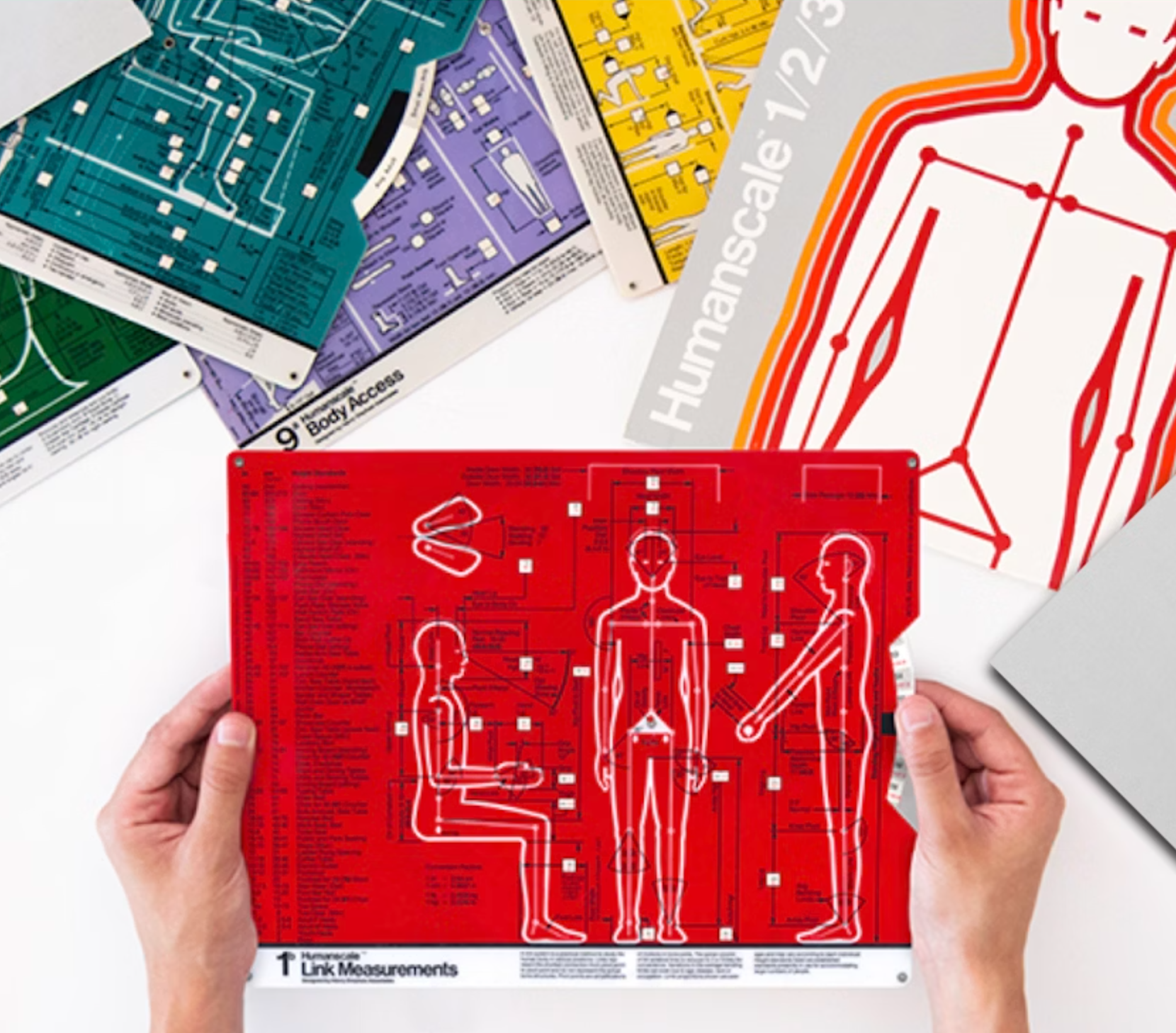
The dimensions and calculations proposed in this tool were inspired by the book HUMAN SCALE © originally published by the MIT Press (Massachusetts Institute of Technology) between 1974 and 1981, whose main authors are: Neils Diffrient, Alvin R. Tilley & Joan C. Bardagjy [Authors] Henry Dreyfuss Associates [design].
This book was republished by IA Collaborative Ventures LCC in 2017 as a KICKSTARTER project.
The proposed dimensions also take account of the Apple et Android guidelines recommendations.
©use.design 2025 - version 1.0 april 2024
This UI Design component size calculator was designed and created by use.design agency
is a UX/UI/Product design agency based in Paris, working with creators of digital products that make working life easier. Since 2002, we have been working with all types of company (from start-ups to major accounts, software publishers, SMEs and ETIs), whatever the business sector (health, fintech, transport, logistics, maintenance, industry, agriculture, etc.) or device (business software, SaaS, ERP & CRM, embedded, mobility, control rooms). We offer a strategic approach to UX/UI design, with a real user focus, enabling companies to successfully address the challenges of engagement, adoption, collaboration and simplicity.
©use.design 2002-2025 - Legal notice
 More information about use.design agency (in French)